Finally here is my zine...
Thursday, April 30, 2009
Tuesday, April 14, 2009
Cover page.
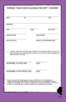
The following image is the cover of my future zine about Philadelphia Murals.
I chose to give the zine a rather grungy/dirty look, because the basis behind most of the murals is to create beauty out of an object that may be thought of as an eye-sore. I wanted the reader to feel inspired that that their voice could be heard.
The main agenda within the zine is going to be a contest for what female high school student can create the best idea for a mural. The student who's idea is chosen will have their mural brought to life among the thousands of murals within the city. That student will also receive a prize that some only dream of...paid tuition at Moore College of Art & Design!
The zine would basically be printed out and distributed throughout most Philadelphia schools. All of the contest rules and details would be included. By including several photographs of Philadelphia's finest murals, the zine would hopefully inspire the students to participate.
Article #2...
The second article that I selected concerning my topic was found using Wikipedia. The article is based on the Philadelphia Anti-Graffiti Network (PAGN), which is a founded by Philadelphian Mayor Wilson Goode in 1984. The network was established to hinder the spread of graffiti within Philadelphia. Two years later, The Mural Arts Project (MAP) was created within PAGN. The programs went on to receive awards due to the positive progress that they had made within the community.
Since it's establishment, the PAGN and MAP have gone on to produce over 2,400 murals within the Philadelphia area. Not only have they enriched the city with their art, but they have also gone on to clean over 40,000 of graffiti. Today, PAGN consists of three programs; Mural Arts Program, Paint Voucher Program, and the Graffiti Abatement Team.
Thanks to those who care so dearly, the city of Philadelphia is not known for it's one of a kind murals than it's unnecessary abundance of graffiti.
Wednesday, April 8, 2009
Why create a mural?
Many are not aware that the murals that have become a staple of Philadelphian culture were the brainchild of a New Jersey artist who proposed the idea of murals to act as a substitute for what was otherwise described as "graffiti". Involving individuals from all walks of life, the vast array of messages shared throughout these works of art were seen as a way to give back to the community. What better way to welcome others to your home/community than with a display of beauty.
The website for The City of Philadelphia: Mural Arts Program is the complete guide to information involving these Philadelphia landmarks. Supplying information for such possible inquiries as: mural tours, mission statements, find/requesting a mural, volunteering, etc.
This particular site is the go-to for anything you may need.
Tuesday, March 24, 2009
Sketch, Scan, and Gradient.
For this particular assignment, we were to sketch an image, scan it onto a computer, and then display our knowledge of the gradient tool.
I had previously created a backdrop, so I simply sketched an image of a car that I could simply add to the backdrop that I already had made.
Here is my sketch:
This is the trace of my sketch:
This is the finished image with the car included and filled in using the gradient tool:
The meaning behind my image is rather simple. As you know, my topic for this blog deals with the several murals located throughout Philadelphia. I decided to create a backdrop of a bridge(or tunnel) that has been decorated with many images that may represent elements of Philadelphian culture. For example, I have a cheesesteak, a pretzel, the American flag, the Liberty Bell, and a few random skyscrapers. I basically wanted to make it seem as though someone might have began to lay down the foundation for a future mural. The car is simply added to show visitors being greeted by Philadelphia.
Thursday, February 26, 2009
Logos!
For our most recent assignment, we were asked to use Adobe Illustrator to create several logos concerning our blog topic. My logos are as follows:
This particular text-less design is of a house, a paintbrush, doodles, and paint splatters. Since my topic is about murals within Philadelphia, I decided to make it seem as though I were covering the dull colored house with designs and color.
This logo basically consists of random shapes that I've created as a background to whatever font goes on top of it. I just wanted to show an artistic design.
This logo is pretty simple. I used the silhouette of a t-shirt and then placed a minor detail on the chest that the main logo would then be located on top of it. A lot of art is simple, and that's why I chose to make this particular logo incredibly simple. Plus, it is something that could easily be made into an actual t-shirt.
For this particular logo, I decided to trace my hand. I then used the paint tools to add paint to the fingertips. In doing so, I wanted to show all of the love and handmade work that goes into all of the murals that are scattered throughout the city. Whether it be sparked by a certain belief or used as an after-school activity for children, the art that we see on walls was created (by hand) for a purpose.
The following logos are text only.
I chose this font, because...well...I thought it was rad. Plus, it reminded me of the font from the movie, Juno.
I chose this font, because I liked how rough it looked. Some of the murals in the city have a rustic feeling to them. (Just like this font.)
I liked this font, because it looked it was so messy. Art is messy. True story.
This last font was chosen, because it was really corky. I think that corky and art kind of go together. That's just my opinion, I guess.
Those are my logos! Personally, I'm drawn to logos that are simple, yet have that little something that can catch your eye. I don't like a lot of fancy font. Hopefully, that can be seen within my pieces.
Friday, February 20, 2009
Graffiti Collage
For this week's assignment, I decided to create a collage based upon the idea of graffiti/art in today's society.
Art has become so relevant to our every day lives, that it is hard to believe that it may have been frowned upon at one point in time. What seems to be a work of art in the year 2009 is much different than what one might have found in the 1930's or 40's. Since my blog has primarily covered the several murals located through Philadelphia, I decided to use my current knowledge of Photoshop to create a "faux" mural.
When beginning this piece, the starting point was of a photograph of a bare wall of what seemed to be an abandoned building. Since the meaning behind certain murals is to create beauty out of something that would otherwise be an eyesore in society, I chose to use certain photographs of street graffiti to decorate the bland palette of the wall.
I used the following photograph of random graffiti to cover the bare walls of the background photograph.
I then added a photograph of an older woman from what seems to be the 40's. Since the art upon on the wall would most likely NOT be found in her time period, I thought she had an appropriate expression on her face. She has a look of what seemed to me to be of disapproval and disgust. Older generations most likely look down upon graffiti thinking that it is a way of violating a particular structure. It is somewhat hard for them to see the expressionism and passion behind some public displays of art.
I also opted to include a piece of street art created by one of my absolute favorite artists, Miss Van. The cartoonish woman at the top left of the wall is one of her "girls" that she is known for painting all over the world. Many artists have tried to replicate her style, but few have come close to recreating her sense of dark sexuality that she includes in her pieces.
Thursday, February 19, 2009
Everything changes eventually...
In this week's post, I decided to dramatically alter both of my photographs because I didn't have anything to improve in my photos. Here is a copy of my original photo taken of a mural located between near 21st and Market St.:
I decided to add a bit of color to the individuals in the mural. In completing this, I used the quick selection tool to select the lightest areas within the faces. I then altered the hue of those selections to red. The following is a photograph of my work:
In the second part of this week's assignment, I have used the lasso tools to drastically alter a particular object within this photograph. Here is my original photograph:
The next photograph is my altered photograph. As you can see, I have selected the building located behind the mural and drastically changed it's hue and saturation. It, in fact, is now bright red, blue, etc.
Wednesday, February 11, 2009
Alternate reality
Within this particular project, I am attempting to use Adobe Photoshop to warp a particular image by replacing it's background.
I will be using the following images to complete this assignment:
Next, I will be taking the following photograph and showing you (the viewer) how I chose to morph two photographs together while replacing one image's background.
As you can see, the young woman in the pixelized mural is now standing in the street (bottom left hand corner) of the other mural.
In this particular image distortion, I'm attempting to show the idea of perspective. Perspective is when you create the idea of an object either receding or projecting into a certain space. Here is my photograph in it's original form:
In the following image, I've used the selection tool to change the perspective of the girl within the mural. I edited the photograph to make it seem as if the girl is protruding out of the mural. In a way, it lookes as if the girl is stepping into the mural from the street below.
Sunday, February 1, 2009
How A City Speaks...
Obviously art has been of interest to me from a young age, but being at Moore lifts that interest to a whole new level. Although Moore itself is quite influential for many artists, the city of Philadelphia also plays a huge role in sharing the gift of artistic freedom.
I, personally, think that this mural attempts to show the possibility of growth within the city through it's youth.
Throughout the city, one can find displays of artistic expression almost everywhere. Whether it be historical art displaying our city's representation of freedom or a touching piece signifying unity amongst a diverse group of cultures, we find ourselves surrounded by voices of those attempting to share their voice with the community.
I have chosen to write about the displays of art within our city. With accompanying photos, I will do my best to show some of my favorite pieces of artistic expression here in Philadelphia. The following are just a few examples of what I will be blogging about:
This is a photograph of a mural that I get the pleasure of seeing almost every single morning. Located at the corner of 20th and Arch, this particular work of art adds a touch of creativity to an otherwise bland looking building.
I, personally, think that this mural attempts to show the possibility of growth within the city through it's youth.
Due to it's somewhat hidden location, this mural is can be easily missed unless you visit the Art Museum area. Applied to the side of what looks to be an apartment, this extremely colorful mural seems to come out of nowhere. It is located almost directly behind the Central location of the Free Library of Philadelphia.
Wednesday, January 28, 2009
A day in the life...
Unfortunately for those reading, my life is anything but exciting. Due to a schedule divided between school and work, my days off are spent being the least amount productive.
I decided to capture a normal Sunday in my every day life.
My morning always begins with breakfast. Since my cooking ability is somewhat limited, this usually includes a batch of egg whites and a peanut butter chocolate chip PowerBar (salmonella-free).
After breakfast, I try to work on any homework that I may have due the following week. This week's task is a letter form project for my Basic 2D Design Lab. I can honestly say that I hate this project.
My lack of interest in my homework project forced my to waste about 45 minutes of my life on Facebook.
Still procrastinating, I also decided to indulge myself in a healthy dose of celebrity gossip.
This may have consumed a bit more of my time than I had planned, but who doesn't want to know all about Lindsay Lohan's constant downward spiral?
After nearly frying my brain, I decided to stop fighting and finish my 2D project. After it's completion, I decided that it was time to pick out today's outfit. When I grow up, I want to get one of the huge closets where you push a button to have the clothes come to you. I could have tops above and bottoms below. I could look through my entire wardrobe within seconds. Sadly, my student budget doesn't yet allow me such luxuries, so I must sift through the piles of garments by hand.
After finding an outfit, it's time to do the bathroom dailies. The dailies include brushing my teeth, brushing my hair, washing my face, and applying the simplest amount of makeup.
Most of my Sundays are spent in one particular place. That magical destination would be the Starbucks, located across the street from Whole Foods on 20th Street. That particular Starbucks is within 5 blocks of my apartment, which makes it rather convenient and oh so wonderful. Since my family occasionally treats me to Starbucks gift cards, my usual drug of choice is a grande no foam soy latte and a rice crispy treat. I honestly believe if I were on death-row, this would be my choice for a last meal. I usually carry a book with me to enjoy with my caffeine fix, but that particular day was spent reading the latest issues of my two favorite magazines: Juxtapoz and New York Magazine.
After spending most of the day lazing around Starbucks, I decided to go home and play with my kitties. Unfortunately, they were not in a playful mood. They decided to do more productive things. Those things were sleep...
Sleep...
And sleep...
As you can see, my days are not as eventful as many others my age. I hope you enjoyed a little insight into my life.
Subscribe to:
Posts (Atom)